.png)


Overview
The Challenge
20% of new users were abandoning the onboarding flow, impacting monthly revenue. Through usability testing of the existing onboarding flow with participants, I discovered that new users were finding it difficult to find information that they needed to accurately record and track their body measurements. This was a problem for a mobile app that aims to facilitate this process.
Results (Pending)
By removing the findability and usability issues in the redesign of the onboarding flow, the rate at which new users will abandon the onboarding process is projected to decrease.
The Constraints
-
I carried out the UX research and UI alone, as well as created all of the illustrations
-
A monthly budget that limited how much user research and design iterations I could carry out
UX Research Planning: Planning to Find out Why 20% of New Users were Abandoning the App
Before leaping into finding out why 20% of new users were abandoning the onboarding flow, I created a UX research plan with stakeholder input. Please see it here: UX Research Plan
Testing of the Existing Onboarding Flow Highlights Findability and Usability Issues
I first tried to recruit new users of the mobile app with an in-app survey I created. This failed to recruit anyone. I was, however, able to recruit five people from an online forum on health and fitness to interview and test the existing onboarding flow with. Three repeated issues came up during this.
ISSUE 1: 60% of participants didn't know what the word 'Navy' meant on this screen
.png)
ISSUE 2: 80% of users missed the 'Help' button in the process of trying to find information about how to measure each body measurement accurately
.png)
ISSUE 3: 4 out of 5 participants tapped on the 'Done' button after entering a body measurement, thinking that it would take them to the next tab to enter another measurement. It didn't.*
.png)
*The usability testing sessions were done remotely, and I shared the prototype of the onboarding flow in Figma on desktop. I then told them to direct me on where they'd like me to "tap" in order for them to complete the tasks I had given them. If participants had used the prototype on a mobile device during usability testing, most of them may not have tapped on the 'Done' button after entering a body measurement. They may have simply swiped left to get to the next tab instead.
Please see the affinity map to discover more usability issues uncovered during the usability testing phase.
The UX Problem Statement
New users are having trouble finding the information they might need before entering a body measurement in the onboarding flow. This causes frustration for new users and leads to some of them abandoning the onboarding process altogether. This is affecting the revenue of the company because new users who end up abandoning the onboarding process are less likely to become returning users.
Design Solution: Removing the Findability Issues in the Onboarding Flow
After sketching some design solutions to the findability issues found in the onboarding flow, I designed high-fidelity designs in Figma. Please see below the new screens that remove the findability issues that were confusing users during usability testing of the existing onboarding process.
BEFORE
ISSUE 1
ISSUE 1: 60% of usability test participants didn’t know what the two methods to calculate body fat percentage meant when they got to this screen. One participant even said that he would leave the app to Google what these terms meant before moving forward with the app!
AFTER
.png)
SOLUTION: In the former onboarding flow, users would have to wait until they reached the home screen to figure out what the terms ‘the Navy Method’ and ‘The Caliper Method’ meant. Now, users can find out what these body fat percentage methods mean by simply tapping on the information icon button next to the terms.
BEFORE
ISSUE 2
AFTER
ISSUE 2: 80% of users didn’t know where to go during the onboarding flow to find out how they could measure their body accurately before entering any body measurements. The information they needed to do this was hidden behind the 'Help' button.
.png)
SOLUTION: With the redesign, users can now read how to measure any given body part correctly and enter that measurement on the same screen. These instructions are not hidden behind a ‘Help’ button anymore.
BEFORE
ISSUE 3
ISSUE 3: 4 out of 5 participants tapped on the 'Done' button after entering a body measurement, thinking that it would take them to the next tab to enter another measurement. Instead they get taken to the home screen because tapping on the 'Done' button "tells" the system that users are finished with entering all of the body measurements they want to track.
AFTER
.png)
SOLUTION: In the redesign, there is no longer a 'Done' button on the screens prompting users to enter their body measurements. Instead there is a 'Next' button. Using the word next instead of done makes it obvious to the user that they can expect to be taken to the next measurement screen and not the home screen.
The Decision to Redesign the Entire Onboarding Flow and Delay Onboarding
Although I could've just redesigned the particular screens that were causing findability and usability issues in the design style of the existing onboarding flow, the client wanted me to redesign the entire onboarding flow. This was especially since the client no longer wanted to use photographs of his own body to demonstrate how users would measure each part of their body accurately. He was open to using illustrations instead.
Delaying the Sign Up/Log On Screen and Onboarding Process
In the existing onboarding flow, new users when they first open the mobile app are confronted with a sign up/log in screen. They are then asked to start making decisions about how they want their body measurements to be recorded and calculated. Next, they are prompted to start entering their body measurements. To new users, this possibly could be a lot to ask upfront, especially since it can be time consuming to measure one's body and then record it.
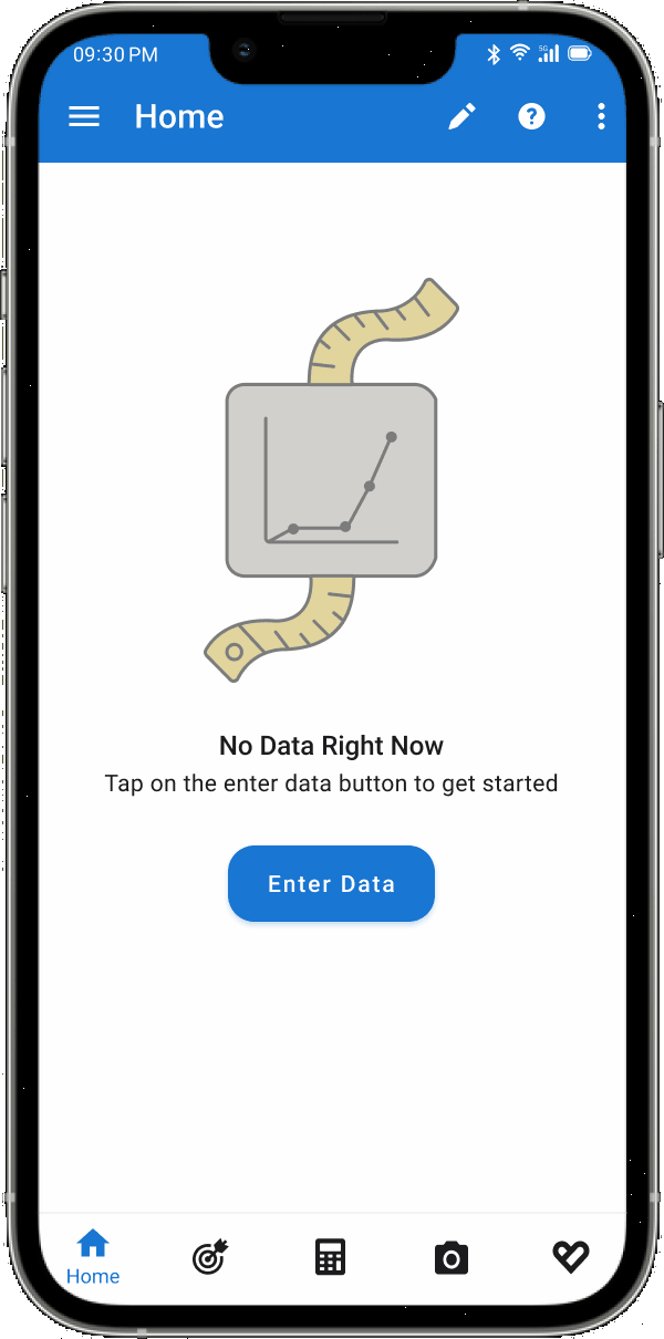
With the redesign, now new users can explore the rest of the app before tapping on the 'Enter Data' button on the home screen to start entering their body measurements. This effectively delays the onboarding process.
The Use of Illustrations to Aid New Users when they’re Entering their Body Measurements
Currently, instructions on how to measure each body part accurately are accompanied by a photograph of the client measuring that body part on himself. The client was open to me creating illustrations in place of these photographs, which is what I did below:
The Use of other Illustrations in the Onboarding Flow
I also created illustrations for the four screens that come before the body measurement input screens, as I thought including some here would make it more consistent with the rest of the onboarding flow.
Testing of Redesign Shows Users Can Find the Information they Need To Enter Body Measurements
I was able to carry out usability testing of the redesign with 5 participants. I asked them to complete the same task set in the previous round of usability testing of the existing onboarding flow. All participants understood what 'The Navy Method' and 'The Caliper Method' meant from the new screen that now includes a tappable information button that brings up a modal explaining each method of measurement. They also had no trouble finding out about how to measure their body accurately before entering their measurements.
High-Fidelity Prototype
What did I Learn from this Project?
The redesign has been launched as of December 2025 in The Google Play Store and Apple's App Store. I will update this section after the app has been live for several weeks.