.png)
.png)
.png)
Overview
The client of The Body Measurement and BMI Tracker app wanted me to redesign the settings screen, because he didn't like how it looked. The following is the story of how carrying out a heuristic evaluation of the existing settings screen, as well as analyzing the settings screens of direct competitors, influenced a redesign. In the new design, the information architecture of the screen has been improved and the design inconsistencies in the original settings screen have been eliminated.
Heuristic Evaluation: Finding Design Inconsistencies and Information Architecture Issues
Below are the main issues I found during the heuristic evaluation of the existing settings screen. My analysis of the settings screen is informed by the information found on the Nielsen Norman Group website, as well as information I gleaned from the Career Foundry and Design Lab websites.
ISSUE 1: Users Expect Data Entered to be Saved Automatically
Users expect that when they change or enter any data in the settings screen that this will be saved automatically. Furthermore, there are two 'OK' buttons on the screen to save any changes that users have made on this screen. One call-to-action button would be sufficient.
ISSUE 2: Discoverability of Explanation of Body Fat Percentage Methods
It's not clear on this screen what 'Caliper Method' and 'Navy Method' mean.

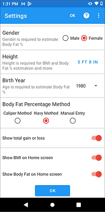
ISSUE 3: Spacing Issues
I think the white space between elements could be increased to improve usability and scannability.
ISSUE 4: Extra Settings Options are Hidden Behind the Question Icon Button
If users tap on the question mark button, they come to see additional settings options, not help. This might be causing user frustration because it doesn't line up with what users expect to find when they tap on such a button.
Competitor Analysis: Comparing the Existing Settings Screen with those of its Competitors
Weight Loss and Measurement Tracker App
I decided to look at the settings screen of the Weight Loss and Measurement Tracker App because the client mentioned it being a direct competitor. The client also liked the design of their settings screen.
ISSUE 1: Potential Content Disorganization
I don’t think the ability to choose the font type for the app is as important as other list items on this screen. However, it appears as the second list item on the settings screen.
ISSUE 2: Too Many Buttons on the Screen
There are too many buttons on the screen that are competing for attention.
ISSUE 3: Empty Navigation Bar Taking up Space
For some reason, there is an empty navigation bar at the bottom of the screen. It takes up unnecessary space on the screen.
.png)
.png)
Back Button Gives Freedom for Users to Go Back
The back button on the screen makes it clear that users can go back to the home screen easily from the settings screen.
Google Fit App
Since premium members of The Body Measurement and BMI Tracker app get the benefit of being able to integrate the app with Google Fit, I thought it would be a good idea to analyze Google Fit's settings screen as part of the competitor analysis.
ISSUE: Not Much Visual Contrast Between Subheading and Value
There's not a lot of visual contrast between the subheadings and values on this screen. Although there is a difference in the size, there isn't much difference in color.
Back Button Gives Freedom for Users to Go Back
The back button on the screen makes it clear that users can go back to the home screen easily from the settings screen.
Good Amount of White Space Between Design Elements
The use of white space is consistent throughout the screen and improves scannability and usability for the user.
.png)
The Use of Headers to Group Similar List Items
Google Fit’s use of headers to group similar list items together improves the readability of the screen.
Any Changes are Saved Automatically
Any changes to this screen are saved automatically.
Final Design: Organizing and Categorizing Content, and Ensuring Design Consistency Between Screens
With the redesign, I improved the information architecture of the screen. By grouping together related content and categorizing it under headers that make sense, I increased the scannability of the settings screen. Furthermore, I increased the white space between list items, which also makes it easier for users to find the information they want quickly.
As part of the redesign, it was additionally important to ensure that the design of the settings screen was consistent with that of the redesigned onboarding flow. I did this by formatting the radio button options vertically instead of horizontally, which is how the same radio button options are formatted in the redesigned onboarding flow.
High-Fidelity Prototype
What did I Learn from this Project?
The redesign has been launched as of December 2025 in The Google Play Store and Apple's App Store. I will update this section after the app has been live for several weeks.